
Create an animated 3D book in CSS, step by step
Posted on July 23, 2020·
A couple of days ago, I created a 3D version for a book I was writing, with CSS only. Because I couldn’t find an easy way to do it (most websites offered to generate images only, and not with the best quality), I created a small 3D book image CSS generator and posted it on Hacker News. There was a lot of interest for it, and since it’s definitely not that complicated, here is a small tutorial to learn how to create your own version.
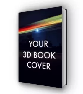
Here is what the final result will look like:
Be ready, we’ll talk about 3D, geometry, animation, and shadow; what an exciting programme! Let’s go!
Step 1 - Set up the scene
We want the HTML to be as simple as possible, i.e. not with a lot of divs and classes. The most simple solution I found was to have a .book-container div (which can be a link for instance) and a .book div, containing the cover as an img (until the last step it will be a div with a background so it’s more easy to see the progress).
<div class="book-container">
  <div class="book">
    <!-- will be a <img> at the end -->
    <div />
  </div>
</div>
We give a size to the .book-container and a border, which is not required but makes things easier to see at first. We also make sure the elements in it (the .book) are centerer horizontally and vertically:
.book-container {
border: 1px solid lightgray;
width: 500px;
height: 400px;
display: flex;
align-items: center;
justify-content: center;
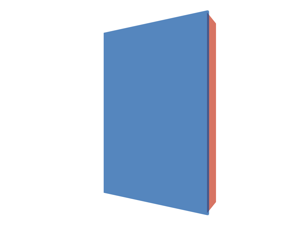
}The .book itself has a fixed size (the size of the cover), and some rounded angles:
.book {
  width: 200px;
  height: 300px;
}

.book > :first-child {
  background: #0d47a1aa;
  width: 200px;
  height: 300px;
  border-top-right-radius: 3px;
  border-bottom-right-radius: 3px;
}
As a result, we have a first shot of our cover:

Step 2 - Add some 3D
To add 3D and perspective, only some CSS properties are needed (it’s amazing what CSS makes us able to do these days…). First we set the transform-style and perspective parameters for the .book-container (you can adjust the perspective and see the different results), then we apply a rotation against the vertical axis (rotateY) to the book:
.book-container {
  /* ... */
  transform-style: preserve-3d;
  perspective: 400px;
}

.book {
  /* ... */
  transform: rotateY(-30deg);
}
Step 3 - Add the pages
To see the pages on the side, instead of adding a new div, we’ll use the pseudo-element ::before, which can be considered as an implicit div. As a first step, let’s just give it a size, and its default position: at the origin of the parent div (the .book):
.book {
  /* ... */
  position: relative;
}

.book::before {
  position: absolute;
  content: ' ';
  background: #bf360caa;
  height: 300px;
  width: 50px;
}
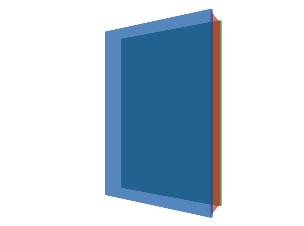
Step 4 - Move the pages to the right place
Here is where it’s getting interesting. To put our pages at the right place, we need to apply them several transformations:
- first, we must translate them horizontally of the book’s width (200px), minus half the book’s thickness,
- then we rotate the pages of 90 degrees (still against the vertical axis),
- and finally we translate them again of half the book’s thickness (still against the horizontal X axis, since it was rotated by the translation as well).
These steps can seem complicated, but if you try to apply them one after the other to see the result, they really aren’t.
.book::before {
  /* ... */
  transform: translateX(calc(200px - 50px / 2))
             rotateY(90deg)
             translateX(calc(50px / 2));
}
To make the pages slighly smaller than the cover, we can resize the pages, move a little their origin position, and update the first translation:
.book::before {
  /* ... */
  height: calc(300px - 2 * 3px);
  top: 3px;
  transform: translateX(calc(200px - 50px / 2 - 3px)) /* ... */
}
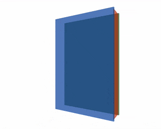
Step 5 - Add the back cover
Since we used the ::before element for the pages, let’s use the ::after one for the back cover. Its dimensions and origin position are the same as the front cover:
.book::after {
  content: ' ';
  position: absolute;
  left: 0;
  width: 200px;
  height: 300px;
  background: #1b5e20aa;
}
Positioning it is a lot easier than the pages: we just have to apply one translation against the Z axis, of a value equal to the book’s thickness:
.book::after {
  /* ... */
  transform: translateZ(-50px);
}
Step 6 - Add some animation
I promised you animation, and for now our book image is still a little bit too static. Let’s fix that!
The first animation we’ll add is to rotate the book on hover. To do that, let’s specify that we want to animate the transform property of the .book via the transition attribute.
.book {
  /* ... */
  transition: transform 1s ease;
}
Then let’s apply the rotation we want (0 degrees, so the book will pass from “rotated” to not “rotated”) in the .book:hover section:
.book:hover {
  transform: rotate(0deg);
}
The second animation we want is when the page is loaded: we want the book to pass from non-rotated to rotated (the opposite animation). This can be done using the animation attribute and a @keyframe animation:
.book {
  /* ... */
  animation: 1s ease 0s 1 initAnimation;
}

@keyframes initAnimation {
  0% { transform: rotateY(0deg); }
  100% { transform: rotateY(-30deg); }
}
Step 7 - Add the image and some shadow
Now that all our elements are correctly positionned and animated, we just need to display the actual book cover instead of colored backgrounds.
<div class="book-container">
  <div class="book">
    <img
      src="https://d2sofvawe08yqg.cloudfront.net/outstanding-developer/hero2x?1595108679"
    />
  </div>
</div>
As a nice small addition, let’s add some shadow to the book, and we’re done!
.book > :first-child {
  /* ... */
  box-shadow: 5px 5px 20px #666;
}

.book::before {
  /* ... */
  background: #fff;
}

.book::after {
  /*  */
  background: #01060f;
  box-shadow: -10px 0 50px 10px #666;
}
Our animated 3D book is now complete! You can find the complete code of this tutorial on CodePen, or have a look at the generator I created or its source code on GitHub.
Note that to make it work with Edge, I had to remove the CSS variables and the calculations (calc(...)) in the transform attribute. It’s a little sad; the first version used CSS variables so size was configurable without updating the core CSS. But at least now it works everywhere! (Okay, I haven’t tested in Internet Exporer, and I won’t 😉)
Hope you liked this tutorial! I’m not a CSS expert, but I enjoyed very much creating this 3D book snippet. See you soon!
Cover photo by Dawid Małecki.
Check my latest articles
- 📄 13 tips for better Pull Requests and Code Review (October 17, 2023)Would you like to become better at crafting pull requests and reviewing code? Here are the 13 tips from my latest book that you can use in your daily developer activity.
- 📄 The simplest example to understand Server Actions in Next.js (August 3, 2023)Server Actions are a new feature in Next.js. The first time I heard about them, they didn’t seem very intuitive to me. Now that I’m a bit more used to them, let me contribute to making them easier to understand.
- 📄 Intro to React Server Components and Actions with Next.js (July 3, 2023)React is living something these days. Although it was created as a client UI library, it can now be used to generate almost everything from the server. And we get a lot from this change, especially when coupled with Next.js. Let’s use Server Components and Actions to build something fun: a guestbook.