
Use Next.js Image component in posts with Markdown
Posted on February 19, 2023·
A few months ago, I rebuilt my blog using Next.js, writing my posts with Markdown. Since then, there was something bothering me: Next.js has a wonderful Image component that lazy loads images and optimizes their dimensions, but it isn’t used for images referenced in my Markdown posts. I had to find a solution, and now I’m giving it to you. 🤫
This post is a preview of an upcoming chapter of my book Serverless Web Applications with React and Next.js.
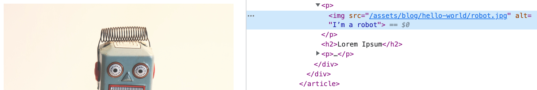
In this post, I’ll start from the Next.js blog starter. In one of its Markdown posts, we can add an image:
Note: you’ll find all the changes I make here in this commit. 😉
If we start the application using yarn dev (after installing dependencies using yarn) and open the post, we can see our image, but it’s a basic img element with the image URL in the src attribute. No lazy loading, no srcset…
The blog starter uses remark to parse Markdown and generate the HTML. The problem with this approach is that we can’t configure it to use some React components in place of the default HTML ones. The trick we are going to use is replacing remark with react-markdown (it’s made by the same team as remark by the way 😉).
Level 1: using ReactMarkdown and next/image
react-markdown is basically a React component (ReactMarkdown) taking some Markdown as input, and generating some HTML as output. Let’s start by adding it to the project: yarn add react-markdown.
Then, we need to change a bit how the content is received by the PostBody component. Currently, in the function getStaticProps in pages/posts/[slug].tsx, the Markdown content is parsed to generate the HTML. Let’s remove this step, so the content stays as Markdown for now:
export async function getStaticProps({ params }: Params) {
  const post = getPostBySlug(params.slug, [
    'title',
    // ...
  ])

  return { props: { post } }
}
Now, we can use the ReactMarkdown component in PostBody:
import ReactMarkdown from 'react-markdown'

// ...

const PostBody = ({ content }: Props) => {
  return (
    <div className="max-w-2xl mx-auto">
      <ReactMarkdown className={markdownStyles['markdown']}>
        {content}
      </ReactMarkdown>
    </div>
  )
}

export default PostBody
Ok this is great, but so far it doesn’t change anything: the image is still displayed as the same img element…
This is where ReactMarkdown is great, as it accepts a components prop that can contain, for each HTML element, a component to use to display it. Let’s define this prop to use Next’js Image component for img elements:
import Image from 'next/image'

// ...
return (
  // ...
  <ReactMarkdown
    className={markdownStyles['markdown']}
    components={{
      img: (props) => (
        <Image src={props.src} alt={props.alt} width={1200} height={200} />
      ),
    }}
  >
    {content}
  </ReactMarkdown>
  // ...
)
Now, our image will have all the advantages of Next.js Image component 😊

What about the hardcoded dimensions 1200x200, you might ask? These dimensions will be used to display the image’s box before it is loaded. They are required by the Image component, so maybe we should find a way to guess them from the image?
It turns out it might be completely fine keeping these hardcoded dimensions, and here is why:
- the dimensions actually control more the image’s ratio than its dimensions, as your layout will probably set the image’s width to 100% of the parent container anyway,
- the image will have the right dimensions as soon as it is loaded, so the worst that can happen is a layout shift (i.e. the content after the image being pushed to the bottom).
Depending on your use case, these two drawbacks may be totally acceptable. But if you want everything to be perfect (I do), here is how we can put the right dimensions 😊.
Level 2: using next/image but with the right image dimensions
The idea will be to get the file dimensions from the file at build time. Indeed, the blog starter uses Static-Site Generation, meaning we can access the files during this generation and extract the information we need.
We are going to update the getStaticProps function in pages/posts/[slug].tsx file. This function won’t return only the post content and metadata, but also the dimensions of each image in it.
To get the dimensions of an image, we can use the image-size library (yarn add image-size), which handles many image formats.
import sizeOf from 'image-size'
import { join } from 'path'
// ...

type Props = {
  post: PostType
  // Let’s add this prop:
  imageSizes: Record<string, { width: number; height: number }>
  // ...
}

export async function getStaticProps({ params }: Params) {
  const post = getPostBySlug(params.slug, [
    // ...
  ])

  const imageSizes: Props['imageSizes'] = {}

  // A regular expression to iterate on all images in the post
  const iterator = post.content.matchAll(/\!\[.*]\((.*)\)/g)
  let match: IteratorResult<RegExpMatchArray, any>
  while (!(match = iterator.next()).done) {
    const [, src] = match.value
    try {
      // Images are stored in `public`
      const { width, height } = sizeOf(join('public', src))
      imageSizes[src] = { width, height }
    } catch (err) {
      console.error(`Can’t get dimensions for ${src}:`, err)
    }
  }

  return { props: { post, imageSizes } }
}
A few notes on this piece of code:
- The regular expressions to iterate over images is pretty basic and doesn’t handle more complex cases, such as links containing images. I wanted to keep the example as simple as possible, feel free to improve it 😊
- For the same concern of simplicity, I don’t check if the image’s path is relative, absolute, or if it’s an URL such as
https://images.somewhere/img.jpg.
Now that we get the images’ dimensions, we can use them in the Post component in the same file:
// Add `imageSizes` in the parameters:
export default function Post({ post, imageSizes, morePosts, preview }: Props) {
  // ...
  return (
    // ...
    <PostBody content={post.content} imageSizes={imageSizes} />
    // ...
  )
}
Back to the PostBody component, where we can now use this new imageSizes prop to get our image’s actual width and height to pass them to the Image component:
type Props = {
  content: string
  imageSizes: Record<string, { width: number; height: number }>
}

const PostBody = ({ content, imageSizes }: Props) => {
  return (
    <div className="max-w-2xl mx-auto">
      <ReactMarkdown
        className={markdownStyles['markdown']}
        components={{
          img: (props) => {
            if (imageSizes[props.src]) {
              const { src, alt } = props
              const { width, height } = imageSizes[props.src]
              return <Image src={src} alt={alt} width={width} height={height} />
            } else {
              // If we don’t have the image’s dimensions, let’s use a classic
              // `img` element.
              return <img {...props} />
            }
          },
        }}
      >
        {content}
      </ReactMarkdown>
    </div>
  )
}
Now, our image has the right dimensions in its width and height attributes 🎉

Hopefully this short tutorial will be helpful to you. There is much more we can do using ReactMarkdown; for instance, I’ve seen developers using the alt part of the image’s Markdown (the blah blah in ) as a way to store attributes for the image in JSON. This is a nice way for instance to embed the image inside a <figure> and add a <figcaption> for its description.
If you liked this tutorial and would like to know more tricks about Next.js, follow me on Twitter and check out my book Serverless Web Applications with React and Next.js 😇
Cover image by Jessica Ruscello. Example robot image by Rock'n Roll Monkey.
Check my latest articles
- 📄 13 tips for better Pull Requests and Code Review (October 17, 2023)Would you like to become better at crafting pull requests and reviewing code? Here are the 13 tips from my latest book that you can use in your daily developer activity.
- 📄 The simplest example to understand Server Actions in Next.js (August 3, 2023)Server Actions are a new feature in Next.js. The first time I heard about them, they didn’t seem very intuitive to me. Now that I’m a bit more used to them, let me contribute to making them easier to understand.
- 📄 Intro to React Server Components and Actions with Next.js (July 3, 2023)React is living something these days. Although it was created as a client UI library, it can now be used to generate almost everything from the server. And we get a lot from this change, especially when coupled with Next.js. Let’s use Server Components and Actions to build something fun: a guestbook.